For all digital marketing campaigns, landing pages have become a must-have. A landing page has a direct impact on the performance of a campaign, whether it’s simply generating leads by asking for email addresses or asking them to sign up for a free trial of a product.
While a well-designed landing page is likely to result in a high number of conversions, a poorly-designed landing page will have the opposite impact – landing page mistakes. It will not only reduce your chances of attracting clients, but it will also harm your company’s internet reputation.
Despite the fact that there are hundreds of tips, methods, and tools accessible on the internet to assist marketers in designing high-converting landing pages, they still make a few popular landing page mistakes that cost them clients.
Take a look at the top landing page mistakes that marketers must avoid while creating landing pages:
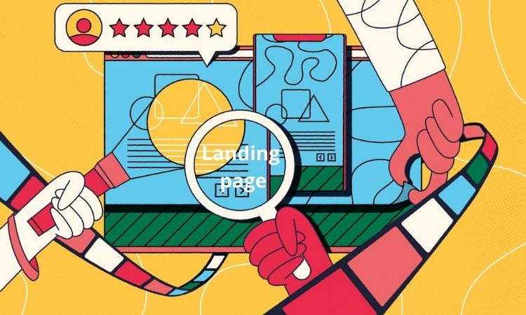
I. What exactly is a landing page?
1. What is landing page
A landing page is a separate page designed for a marketing or advertising campaign in digital marketing. It’s the place where a visitor “lands” after clicking on a link in an email or ads from Google, Bing, YouTube, Facebook, Instagram, Twitter, or other websites.
Unlike web pages, which usually have multiple aims and promote research, landing pages have a single emphasis or goal, referred to as a call to action (or CTA, for short).
Landing pages are the ideal alternative for raising the conversion rates of your marketing campaigns and minimizing the cost of gaining a lead or sale because of this concentration.
Most marketers do not consider a website’s home page and other web pages to be landing pages. This is owing to the pages’ well defined purpose. The Home page, for example, isn’t usually developed with a single CTA in mind. A Home page’s purpose is to introduce a visitor to the website/brand and show them what content is available. There are various navigation paths available to guests, however there is no dedicated CTA.
2. Types of Landing Pages
There is a lot of variation depending on the business, but there are really only two classic landing pages (defined by their goals):
Landing Pages for Lead Generation: Also known as “lead generation” or “lead capture” pages, these pages use a form as their call to action. Lead generation landing pages are designed to convert a targeted website visitor into a lead for your company by collecting personal data such as: Name, Company Name, Email Address, Phone Number, Job Title, Company Size, Social Media Profile
This form of landing page is used by marketers and organizations offering high-ticket items to establish a list of potential consumers. In exchange for contact information, they will provide anything for free, such as an ebook or a webinar. Ecommerce businesses can also utilize these pages to expand their mailing lists, offer free shipping, or offer special bargains.
Clickthrough Landing Pages: Clickthrough landing pages are frequently used by Ecommerce and SaaS (software-as-a-service) marketers to drive sales or subscriptions. Click-through landing pages contain information about a discount, promotion, or deal with the hopes of persuading the user to make an immediate purchase. These landing pages are usually straightforward and are utilized later in the buying process. As a call to action, they usually contain a basic button that directs the visitor to the checkout flow (such as the app store) or completes a transaction.
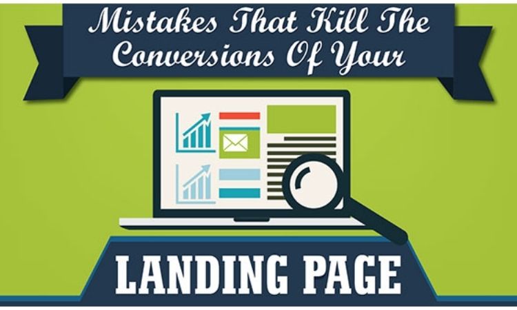
II. Landing page mistakes marketers need to avoid
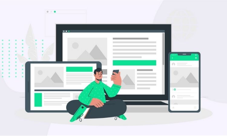
1. Not Having a Responsive Design
Let’s face it, the majority of internet users are looking for information that is simple to absorb and useful. You’ve lost a potential buyer if your landing page isn’t responsive enough to entice others – this is one of the basic landing page mistakes.
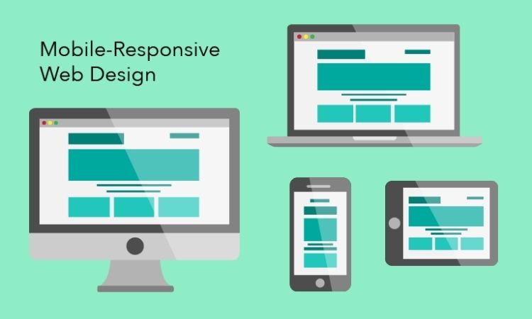
A responsive design provides an improved surfing experience by allowing a single site to modify and accommodate to the size of a user’s device – all while maintaining the same source content and URL. Responsive websites’ flexible and fluid layout adjusts according to screen size, ensuring the optimum user experience across a wide range of devices without compromising the website’s capabilities.
You can’t hope to reach tab and mobile visitors without sacrificing usability and overall user experience unless your website is created with responsiveness in mind. Responsive design is no longer a smart luxury; it’s a razor-thin line between success and oblivion, especially because Google now uses a website’s mobile presence as a ranking indicator in its search engine algorithms.
Note:
While mobile internet users have surpassed those who use a traditional desktop, it’s vital to remember that desktop users still account for around 42% of your website traffic.
So, in addition to developing a mobile-friendly landing page, bear in mind that individuals who view it via a traditional desktop may be seeking for more information about your services.
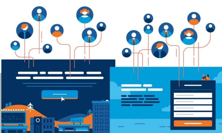
2. Too much/Unclear Call To Action (CTA)
Your call to action is exactly the beating heart of your landing page.
It is noticed that a lot of typical blunders when it comes to calls to action. You can have an excessive number of them. Alternatively, you may have positioned the call to action at the bottom of the page or even made the CTA the same color as the website backdrop.
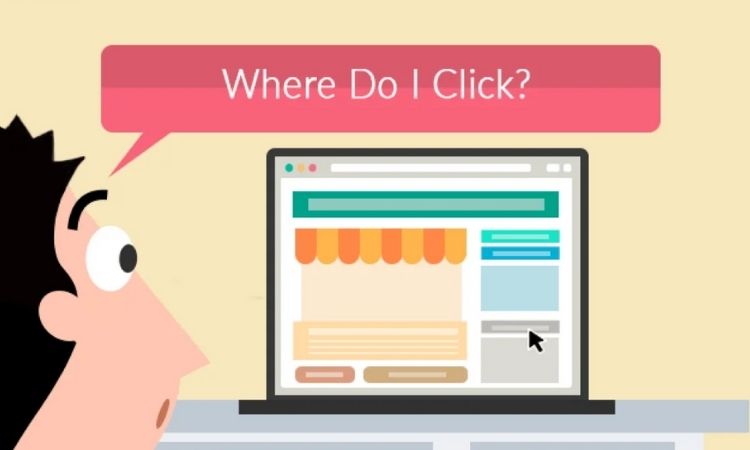
So, make sure your CTA is clear and clickable:
- Less is more. Try placing one call to action per landing page.
- Keep it visible. Place call to action in an accessible location to the visitor.
- Make it distinct. Use colors contrasting with the design of your page.
3. Limp Headlines
In a few straightforward, jargon-free words, great headlines skillfully encapsulate a complicated value offer, but you may be still making this (landing page mistakes). When consumers see it running through their News Feed or showing up in their email inbox, they receive a first impression.
The most effective headlines accomplish one of two goals:
- Bring happiness to others (you know, in a strictly G-rated way)
- Remove the source of discomfort
The first alludes to the ideal of simplicity, or zen, which has been discussed in earlier examples. People are stressed out, overworked, and overcommitted. Giving them an easy, pain-free solution (preferably one that performs the job for them) is a good approach to spark their attention.
The second focuses on negative messaging, which has a 63 percent higher click-through rate than positive messages. Those that assist individuals defend themselves from external dangers are among the negative headlines. As though they were bed bugs. Which is disgusting. And it seemed to be EVERYWHERE!
4. Fail to Explain What the Offer Is
The majority of clients are looking for information that is simple to absorb and useful. If your landing page can’t deliver its message in 5 seconds – one of landing page mistakes, you’ve just lost a potential buyer.
One of the biggest deterrents to getting leads on a landing page is failing to explain your value proposition succinctly and promptly. Visitors want you to instantly explain what makes your organization and content unique.
To prevent this blunder, distill your marketing message down to its most basic value proposition. Inform visitors about the problem you’re trying to solve, how you can help them in their everyday life, or the main advantage of your product.
5. Slow Page Speed
Whether you like it or not, speed is arguably the most important factor in landing page success without landing page mistakes. When a website takes longer than 5 seconds to load (landing page mistakes), 74% of users abandon it.
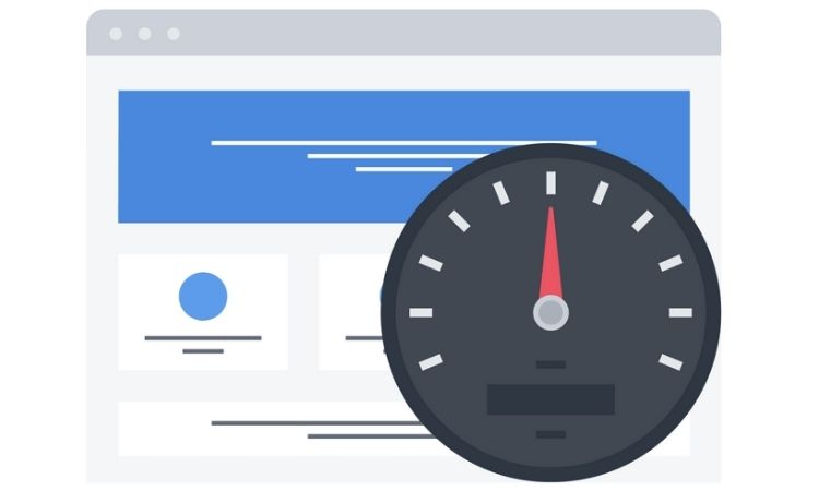
For eCommerce sites, the situation is even worse. Even a three-second delay can cause half of your visitors to bounce. That’s why some of the world’s most well-known companies can load websites in under a second!
Unfortunately, no matter how good your landing page offer is, it won’t be seen if they don’t stay long enough to view it. Particularly on mobile (which has overtaken desktops in terms of internet consumption) and across many pages within a single conversion event.
Pingdom or Google’s PageSpeed Insights may let you rapidly determine how quickly (or slowly) your pages load on desktop and mobile devices. You’ll also get some particular fixes recommended, such as which pictures need to be optimized.
6. Too Much Clutter
It is said that 48% of landing pages contain multiple offers and Only 16% of landing pages are free of navigation bars. What makes that so bad? Because firms can experience a 100 percent improvement when landing pages are targeted and navigation is removed.
This is why having a landing page with a simple and user-friendly design is critical. A well-designed landing page with complementary colors and fonts gives you a more professional and less shady appearance without landing page mistakes.
When your landing page looks like it offers all important information that a potential lead needs to convert, every extra element that you add to the page is nothing but the distraction lowering the importance of everything else on the page.
One thing that sticks out in any list of top resources on effective landing page examples, such as this one or this one, is that they’re all clean, well-organized, and clutter-free. They’re laser-focused on one (and only one!) action on each page, ensuring that users know exactly what to accomplish.
As a result, ensure that your landing page is only focused on one activity, no landing page mistakes. Remove any additional navigation or features that might direct the visitor to a different part of your organization. The clearer the design, the easier it is for the visitor to absorb the information you’re providing.
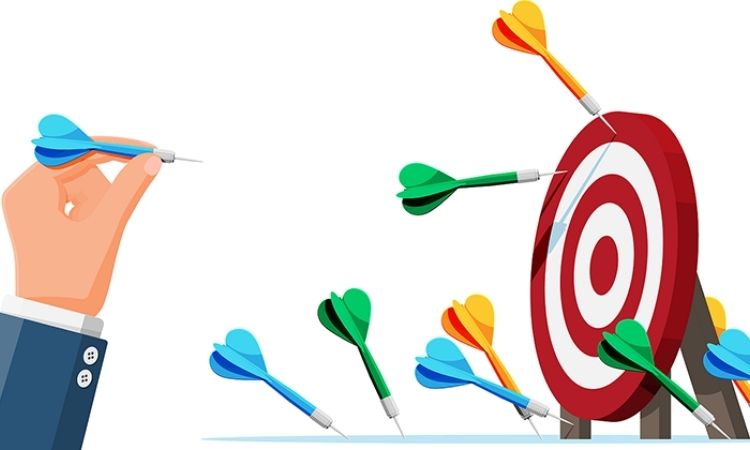
7. Not Conducting A/B Tests
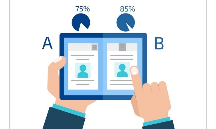
One of the most efficient ways to test your landing pages is to use A/B testing. All you have to do now is update one element of your website and test both of them. You can figure out what works best for your audience by looking at the stats.
When it comes to building a landing page that converts without landing page mistakes, there are no hard and fast rules. While one component of your business may work perfectly for another, it may cause you to lose consumers. This is why A/B testing your landing pages is critical.
This is the practice of developing many variations of a landing page and measuring conversions for each to enhance the campaign’s overall performance. Changing numerous website components that are likely to catch the visitor’s attention or convert him is part of the process.
The following are some of the aspects that you should split test on your landing page without landing page mistakes:
- Background colours
- Page headline
- Type of offer made
- Offer text
- Call-to-action text
- Web form copy
8. Lack visuals
If you don’t know, Visual information is processed by human brain 90% of the time. In fact, images are processed in the brain 60,000 times quicker than written material. If your landing page hasn’t been able to successfully communicate its value proposition, you’ll need to include graphics that will.
Make it simple for the visitor to grasp what your business does and what value he will receive from it, whether it’s with a few product photos, how-to videos, or short gifs.
The graphics on each page should, for the greatest results without landing page mistakes:
- Demonstrate how your product or service is being used (or in context)
- Give people a taste of what they may expect.
- Demonstrate the transformation before and after.
- Draw attention to the ‘after’ final product so that people may see themselves in it.
9. Lack of trust elements
In today’s digital world, there are a plethora of companies offering identical products and services. While some are well-established in the business, others are just getting started and developing a name among their target demographic.
As a customer, I don’t want to be connected with a product that is half-finished, in beta, or offers no guarantees. If there are no trust signals on your website ( one of landing page mistakes), most visitors will not convert.
Adding social proof to your website has become essential for establishing trust, and doing so may significantly increase your conversion rate. According to a case study conducted by Conversion Rate Experts, incorporating social proof resulted in a 44 percent boost in conversions.
Social proof can be in the form of one of these types:
- Reviews
- Testimonials with the customer’s name, company name and picture
- Logos of companies you’ve worked with
- Video testimonials
- Trust badges
III. Conclusion
You can’t just slap some text and images together and call it a landing page – like the landing page mistakes above.
Landing pages require more than simply a nice design. They must be well-planned based on facts about your target market, what they want, and how you can effectively communicate your value proposition to them.
So, invest some time and money in page design, copywriting, and testing your options. There are many more tips and techniques to creating the ideal landing page, but if you avoid these landing page mistakes, you’ll be well on your way to higher conversion rates and visitor happiness.
Read more:
- Print On Demand Copyright | All You Need to Know for Business
- 5 Effective Ways To Boost Shopify Traffic And Get Sales
- Top 10 Successful Print on Demand Store Examples in 2022
- 10+ Effective Landing Pages Design Tips to Promote Your Print On Demand Store
- How To Find Print On Demand Niches To Run A Success Business 2022