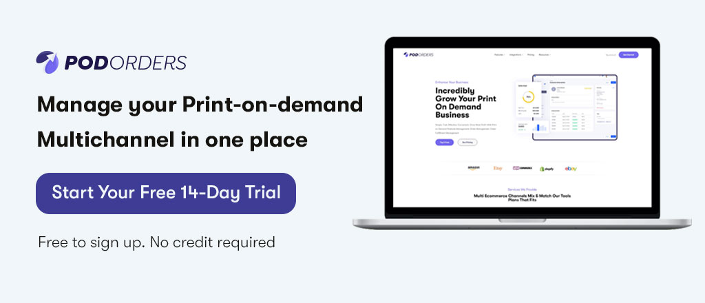
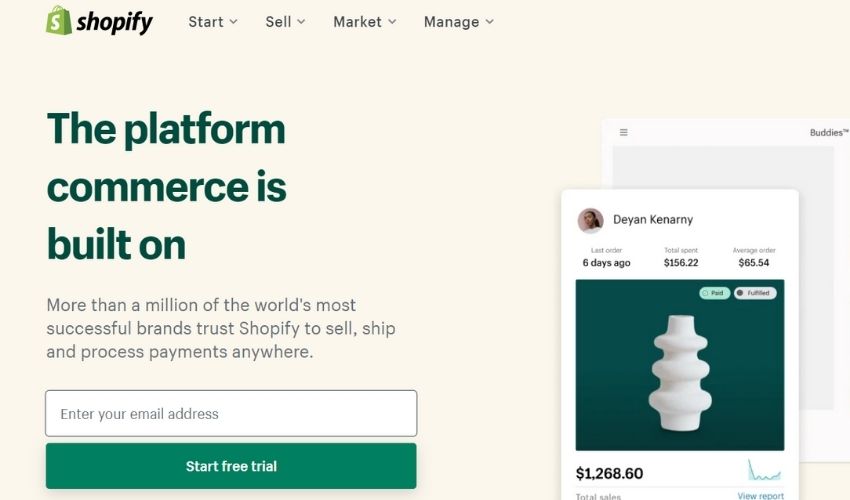
User interfaces usually consist of many different elements. Each of them plays an important role in the effectiveness of the user experience as well as the conversion rates of websites and apps. Having an attractive print on demand landing page with a better UX Call to action button for customers’ experience, your business can meet the goals and objectives they are expected to achieve. So what is a Call To Action? How to create an effective CTA?
1. What Is a Call to Action (CTA)?
Call To Action – CTA is a piece of content, such as text or a button, that stimulates visitors to take action after reading or watching a video about your product or service. It is a particularly powerful tool in digital marketing for converting users, readers, or general audiences into a solid lead that will eventually convert into sales.
This is an important step at the beginning of the buyer’s journey and can be used to encourage a variety of actions, depending on what the immediate goal is. There are 3 things to notice about CTA:
- The desired action is relatively diverse such as placing an order, calling, entering an email, completing registration, navigating to another page… the specificity of the CTA depends on the model and type of business product you do business with.
- Target customers – sometimes your CTA doesn’t work, maybe not because of it, but because the person who sees it is not the audience you want.
- In order for the target customer to take the action you want, it is important that you really understand them, understand their portrait (Customer avatar), and understand each of their secret needs (Customer insights) to create a “powerful” reason for them to act.
2. Why Should Use Call To Action In Print On Demand Business
- Expand your customer base: Call-to-action buttons like “Add to list” or impactful “Buy Now” act as leverage for your online Print-on-demand business. From there, your audience or potential customer database will grow. An increased number of potential customers also means a greater ability to sell print-on-demand.
- Improve Your Conversion Rate: CTAs actually improve Your Print On Demand business conversion rates by tapping into your customers’ curiosity and incentivizing them to expand the number of clicks on your eCommerce store. As the conversion rate will increases, it will be easier for you to get customers to visit your POD products. CTA provides customers with the easiest path to access, eliminating problems.
- Enhancing user experience: User experience is an important factor in enhancing reputation as well as improving the customer service quality. CTA improves user experience by reducing frustration and increasing usability, which in turn increases consumer loyalty. Customer satisfaction is an important factor in helping you sell more print-on-demand products.
3. Call To Action Types
3.1 Sign Up New Account
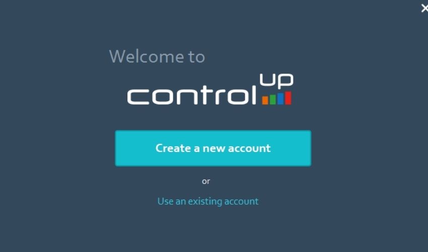
When users first access a sales funnel, they will easily see invitation buttons like “Create New Account”. Users may be invited to sign up for a free trial of a software product, or even a service. The CTA will depend on the type of product the business offers. This type of CTA helps stimulate customers to sign up for an account quickly and easily.
The more prominent and conspicuous the “subscribe” button is, the easier it is for users to click.
3.2 Call To Action Subscribe
This CTA does not commit the visitor to purchase. Instead, this type of Call to Action helps turn regular visitors into a brand’s subscribers, who can receive updates from your online store. They may not have become customers yet, but their signing up increases the ability to increase more sales, as well as build credibility for your store.
3.3 Call To Action Try For Free
Most people like to enjoy free offers. To attract more customers, almost every sales channel or website has free trial offers for a limited. This type of CTA allows new users to try out a product or service before deciding if it’s worth the cost to them. This also stimulates access to more potential customers.
A good experience is highly likely to turn a passerby into a loyal customer.
3.4 CTA Social Sharing
Thí type of CTA encourages users to share a piece of content of a web page with their friends on other social networks like Facebook, Twitter, etc. It is considered one of the simplest types of call to action. Social share buttons are a low-commitment way for visitors and ideal customers to engage with your brand more, and it’s highly effective.

This type of CTA has a feature that is really easy to customize. So make sure your CTA is placed in prominent, conspicuous, and meaningful places on your website.
4. Top 8 Useful Call To Action Tips – How To Write To Get More Sale

4.1 Use Verbs
What you need to do is create a clear and concise CTA. With the character limit set at 35 characters per description line, you won’t have a lot of space to say all things. It’s important to get straight to the point, let your customers know exactly what you want them to do.
- If you’re running an e-commerce platform, start your CTA with those verbs like “buy it now” “shop now” or “order it right now” These words really work and are used a lot in some markets.
- If you want to share a newsletter or a document, motivate users by starting your CTA with words like “download” or “subscribe”.
- If you want users to ask for more information, try using phrasal verbs like: “fill out the form for…” or “find out how…”
4.2 Focus On FOMO
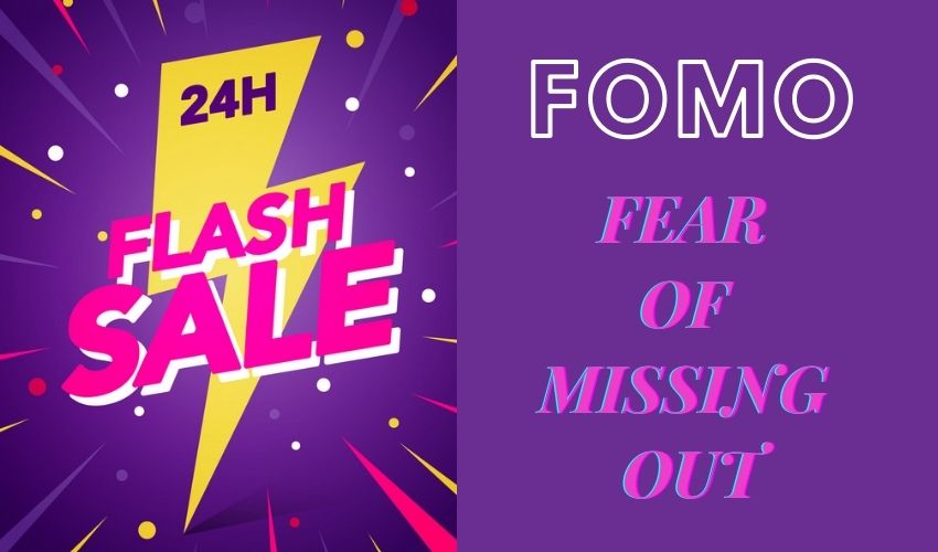
This is actually one of the most effective tactics when it comes to CTAs. Surely everyone has experienced the feeling of fear of missing out, also known as FOMO. Customers develop this feeling when they think they might lose an opportunity to purchase a product or experience a service that may not reproduce, especially for limited-edition, rare, or exclusive products, limited service, and more. If they don’t spend the money right away, they might miss out.
You’ve probably seen some CTAs that target the fear of missing out or make products exclusive including words and phrases like:
- Now
- Limited Time
- Only [X] Available
- One-Time
- Only 24hrs Left
It’s hard to ignore such a reminder especially with a rush of time. Facing the limitation, customers will not have too much time to consider, which promotes the purchase process to happen much faster.
4.3 Use Numbers When Possible
Customers often have good respond when they see numbers like prices, discounts, promotions, offers, and more. If a customer sees the pricing information in your product ad and decides to click through to your website, it shows they are still interested in the product or service you are offering.
However, if your ad doesn’t include pricing information, someone may still see your post but the likelihood of a click will decrease, or they will still visit your store and then leave quickly because of the terrible price.
Try using the pricing information in your CTA, as well as any other digital information, such as “Shop today for TVs under $300!”. This is a good strategy that not only tells buyers that they will pay less for a TV but also hits the FOMO factor.
4.4 Create Exclusivity And Urgency In Your CTA
Think about the benefits you are providing to your customers and emphasize the more impressive benefits. When writing a CTA, to create a sense of urgency you can use words like:
- Now
- Right away
- Today
These are short, clear, and precise. They’re what you need for your call-to-action button to get readers to act as soon as possible. Besides, customers love to own exclusive benefits. Hit their psyche and use the following adjectives:
- Exclusive
- Elite
- Private
Then combine urgency and excitement. Your CTA is ready to go. For example, ‘Get My Exclusive Offer Now’
4.5 Use Secondary CTAs
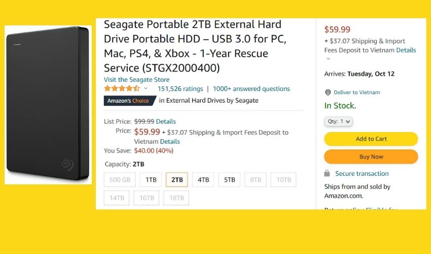
You are concerned about giving your customers too many options as this can in most cases confuse them. However, some eCommerce channels like Amazon use a lot of CTAs and work extremely well. Every Amazon product page usually includes two main CTAs:
- “Add to Basket”: Add this product to your cart and continue shopping for more products
- “Buy Now”: When customers click this button, they will take them directly to the checkout page if they know they have finished shopping.
Some other channels and blogs also often use the “Learn More” button that helps customers learn more about the product as well as its various benefits.
4.6 Keep Your CTAs Concise
In fact, using too many words is a big CTA mistake. So keep your call to action concise. But how? Each CTA should consist of only two to five words. This will give you enough space to engage your potential customers and encourage them to act without rambling.
If you must use more words than recommended above, consider using “Bonus Text,” which is the text below your CTA button or link that provides more information. Your call to action could be “Give [Product] a Try”. Below that button, you might have a sentence like “Absolutely free for the first 30 days!”.
This allows you to design concise CTAs while still fully conveying other important information.
4.7 Use Buttons
This sounds obvious, but in fact, not every CTA is created in the form of a button. However, using CTA as a button generates 45% more clicks. Take a close look at the CTA designs, and make sure they really look like a button, because it’s easy for customers to get confused. This will make them uncomfortable and turn away.
Besides, the size of the buttons is also very important. Buttons should be designed to be large enough with distinctive colors. This will increase CTA visibility to your customers. There are many unique CTAs out there. Think about the obligations as well as design your CTA buttons correctly to represent the message. However, be careful how you present them because it is your opportunity to get leads, increase subscribers and sales.
4.8 Keep It Simple
Do you often have to click on the buttons below when shopping for e-commerce or when you are looking for a document, right?
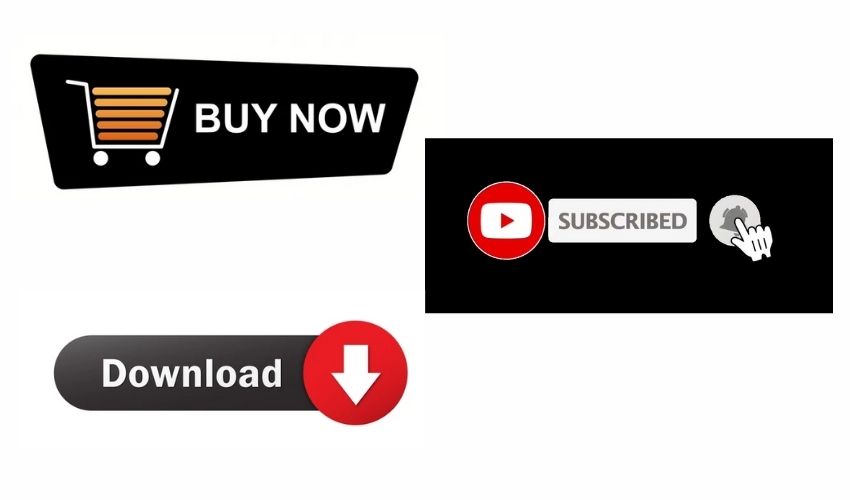
- “Buy Now”
- “Subscribe”
- “Download”
- “Click Here”
Creating unique CTAs is great, but they don’t always work as well as you might expect. Instead, for most businesses, their best option is to stick with the tried-and-true CTAs that have been good to use. With CTA, information is as simple as possible, customers can clearly know the content with just a glance.
Ideally, the words you choose for CTA buttons should clearly describe the resulting action to the user.
For example: “Add To Basket”: That means to add the product to a shoppers basket
5. Top 4 Call To Action Examples For Ecommerce Sale
5.1 Bamboo Underwear
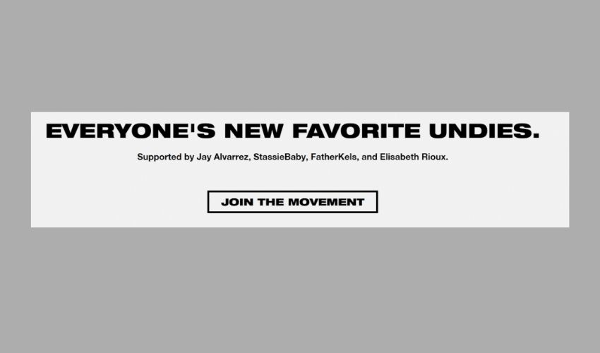
- CTA Position: Homepage
- CTA Button: Join the movement
Social proof is expressed by the brand itself in their call to action by emphasizing their product is ‘everyone’s favorite undies’. They then show off some of the social media celebrities using their products, making their brand even better.
In fact, social proof increases conversions by up to 34%, which is a solid and powerful move from their marketing department. Just below the message, they use a “join the movement” button that helps attract potential customers to join the trend quickly and quietly.
5.2 REI
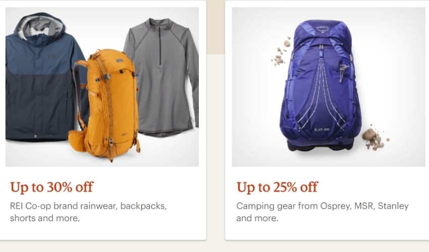
- CTA Position: Homepage
- CTA Button: Shop REI Outlet
The CTA is super simple but gives exactly what a user can expect with the click of a button: Up To 30% Off. And just to make this clearer, REI lists some other “Up To …Off” products that users can expect to find on the other side of the button. There are no ads for this CTA and users are free to review them. This strategy makes their audience go with what they calculate without pressure.
5.3 Everlane
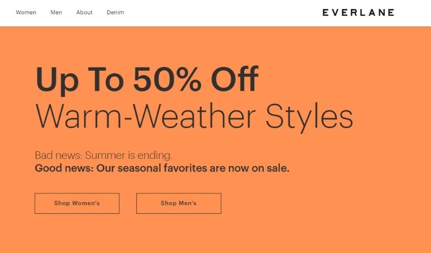
- CTA Position: On the header navigation bar
- CTA Button: Shop Women’s & Shop Men’s
In a price-competitive industry, Everlane is transparent about every aspect of a product’s manufacturing process. That way, customers know exactly how much money they’re actually investing in buying a product and feel confident that Everlane’s products are made with quality.
Their discounts for both man&women’s products are clearly displayed on the navigation bar ensuring their customers won’t miss out.
5.4 GREATS
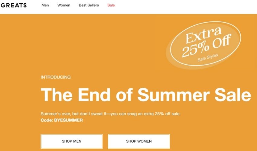
- CTA Position: On the homepage
- CTA Button: Shop Men & Shop Women
GreatS clearly displays the referral program CTA on the homepage. This is their famous revolutionary direct-to-consumer business model. This tactic is powerful because it keeps their referral program a top priority and keeps customers from being overlooked.
Greats’ CTA is designed to be concise and to the point, letting their audience get exactly what benefits they can get from it ($25).
5.5 Spotify
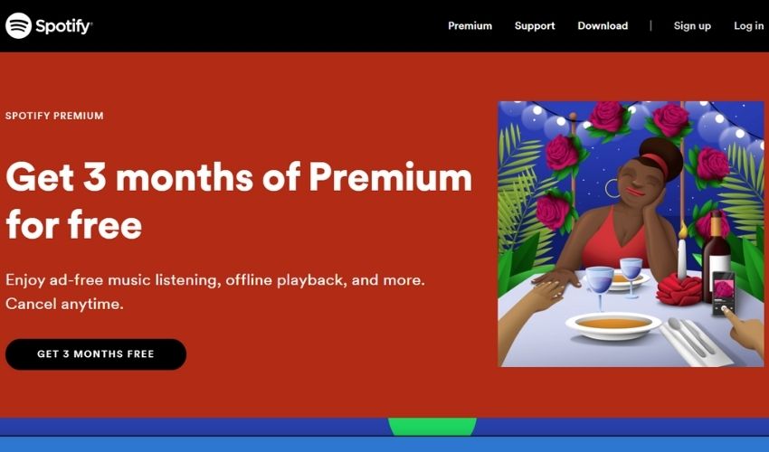
- CTA Position: Homepage
- CTA Button: Get 3 Months Free
Of all the paid streaming services, Spotify cuts through the hassles of downloading and promises millions of free songs. And instead of asking people to sign up or join, they make the default users sign up with the benefit of up to 3 months of free usage.
6. Final Thought
An interesting Call To Action will be the decisive blow to the customer’s order closing. The CTA button will encourage your customers to click to register or leave information. That is very important for the later sales phase. The article about CTA – Call To Action above hopefully has provided some useful information for you.
Read more
- Etsy Ads For Beginners: 7 Strategic Tips to Succeed Any Campaigns
- 9 Effective Tips To Win The Amazon Buy Box – Amazon Seller Guide
- Copyright And Trademark Printing: Things You Must Know (2022)
- Overview Of 10 Best Multi-Channel eCommerce Software in 2022
- Top 10 Powerful Free Amazon Keyword Tool To Boost Sales