A/B testing is a widespread strategy in internet marketing, especially for those trying to improve the conversion rate of a landing page. Many marketers appear to struggle with deciding what to test on a landing page and why they should test it.
We’ll go through these top landing page A/B tests you can do to optimize the performance of your landing pages in this post. The article includes examples to demonstrate how and why each piece is evaluated. You should know what to A/B test on your landing page and how to execute it at the end.
Let’s start by explaining what A/B testing is and which components of the landing page you should test.
I. What is A/B testing
1. What is A/B testing
A/B testing is a crucial conversion optimization technique that involves comparing the performance of two landing pages – generally landing page ‘A’ and landing page ‘B’ – to discover which one generates the most conversions.
You may be evaluating any sort of conversion. Perhaps you want to increase email sign-ups, persuade potential customers to download a piece of content, or persuade them to make a purchase. You want to improve your conversion rate, which is the number of individuals who perform a desired action as a percentage of the total number of people who visit a landing page, by using A/B testing.
A decent landing page test examines two slightly different versions of the same page (where just one single element changes) to determine which one converts better.
A/B testing is a popular method for comparing two distinct types of landing pages. These sites usually have a single aspect that sets them apart. If you test more than one factor, you won’t be able to pinpoint exactly what produces an improvement.
2. Why should do landing page A/B tests
Landing page optimization requires A/B testing – landing page A/B tests. With a landing page test, you may enhance a variety of aspects, all of which will eventually lead to the objective of increasing your conversion rate.
An A/B test is most often used by marketers to acquire one of the following insights:
What design or copy modifications will boost the number of individuals who fill out the form — whatever that form is?
How can you improve sales? What design or copy modifications would encourage more people to buy?
How to increase content engagement – When you get your landing pages perfect, you’ll see an improvement in both visitor engagement and conversion rate. Visitors may elect to explore the remainder of your site or follow your social media profiles even if they aren’t ready to click, providing you the opportunity to engage with them later.

What aspects truly compel the audience to pay attention – What makes your target market tick? Is it a specific topic? What are the different sorts of content? Do you want to imitate the tone?
One of the best things about running tests on your landing page A/B tests is how risk-free it is. If you test an option and it doesn’t work, you may hide that version of the website from visitors and try something else. And you learn just as much about your customers from what doesn’t work like you do from what does.
3. A/B testing in marketing: How does it work?
The first step in A/B testing is to create two alternative versions of your landing page, but with so many variables to consider, it can be difficult to decide what to change and test initially.
The best landing page testing, on average, concentrates on the areas that have the greatest impact on conversions.
From start to end, here’s what the procedure looks like:
Gather information on how people engage with your landing page. To find out what visitors do once they arrive on your website, use Google Analytics, Facebook Audience Insights or a comparable service. You may also use this tool to calculate the conversion rate.
Form a hypothesis about what’s impacting conversions on landing page, what needs to be changed, and what effect you expect it to have. Consider the following scenario: By eliminating a form field from the sign-up form, more visitors will complete it. It’s critical to have a method for measuring this.
Change the element you found to be the most likely source of the conversion problem. Remember that in an A/B test, you only alter one variable.
Allow enough time for your test to get reliable, statistically significant findings. You’ll only know if your landing page A/B tests were successful if you do so. 50 percent of visitors to your landing pages will view the original version (the control), while the other 50 percent will see the modified version (the variant).
Evaluate the outcomes and take appropriate action. Implement the variation if it improves conversions. If not, go back to the hypothesis step and try again. If one variation performs significantly better than the other, utilize that page as the starting point for your next test, altering one element at a time.
II. Important Requirement for landing page A/B tests
1. Call to action
The call to action is determined by two factors: where it is placed and how it is phrased. With that in mind, let’s first consider the significance of where you put it.
Contrary to popular belief, placing your call-to-action above the fold is not always the best option. If you’re unfamiliar with the term “above the fold,” it refers to the section of your website or landing page that can be seen without scrolling down.
According to research published in recent years, information placed above the fold grabbed 80% of a consumer’s attention. Marketers were correct in seeing this as a hint that their value proposition should always be placed above the fold. They were mistaken in believing that this meant their call-to-action had to be present at all times.

The second aspect of a call-to-action that we’ll look at is how it’s phrased. The capacity to say the same exact thing at least ten different ways is among the most wonderful and irritating aspects of the English language. Your call-to-action is no different, except that which of those ten alternatives you choose, even though they all imply the same thing, might make all the difference to your visitors.
The chart below shows the effect of utilizing “Get” vs. “Order” on conversion rates. In most cases, best practices recommend utilizing actionable language in your CTA. Commonly used proactive phrases are “Sign Up,” “Register,” “Download,” and “Order.”
While “Order” highlights what the user must do, “Get” converts better since it emphasizes the reward the user will receive. This benefit-focused approach is a marketing strategy that should be employed throughout your landing page language, not only in the CTA.
2. Images
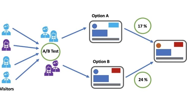
A popular best practice is to use photos on landing pages. One original landing page and its variation are shown below, with the only difference being that one features a picture and the other does not. Can you figure out which one did better?
If you, like the majority of people, predicted that Version B would win, you were incorrect. Without using an image on the website, Version A received a 24 percent boost in submissions. While the woman’s image above the opt-in form in Version B added to the page’s overall aesthetics, looks aren’t anything when it comes to conversion.

Your picture, like everything else on your web page or landing page A/B tests, needs to have a purpose. Not only does the picture in Version B scream “stock photo” (despite the fact that it isn’t), but it also pushes the opt-in form down the page, which, as I stated in the previous section, isn’t always a negative thing, but something you should consider based on the intricacy of your product.
Rather than merely adding photos for the sake of it, make sure that each image on your landing page communicates a feature of your offer that your content does not. Take a peek at the T-Mobile landing page, which is seen below.
What is meant to make your guests feel safe and comfortable can occasionally be misinterpreted as a request for money. Because visitors are accustomed to seeing security badges on website check-out pages, including one on your opt-in form may scare them away, leading them to believe you are about to ask for their money. While most regular web users don’t make this connection, not all of your visitors will. As a result, it’s sometimes preferable to reserve the security badges for later in your sales funnel, or for a separate area of your landing page than the opt-in form.
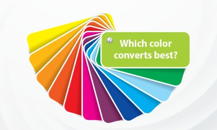
3. Colors
The tiniest things may sometimes have the biggest impact on your conversions. It’s altering the light green color of your CTA button to yellow ( 14.5 percent conversion increase). Alternatively, inside a single picture, contrasting the color of two connections (60 percent increase in conversions).
The psychological effects of six primary colors are as follows:
Blue: Most people’s favorite color is blue, which is popular across all genders and all age groups. It is supposed to give the feeling of safety and trust. Darker blues imply expertise and honesty, whereas lighter blues are relaxing.
Green: Green is the simplest hue for the eye to process and is associated with prosperity as well as environmental issues. Green represents encouragement and positive activity (think,’green means go’).
Purple: Purple is the second most preferred hue among women, with 23%. Purple is associated with serenity, femininity, and prosperity. Purple, on the other hand, is the color of choice for 0% of the male population.
Red: Passion, enthusiasm, and urgency are all linked with the color red. Many people connect red with negativity and errors, therefore it’s a risky hue to use in landing page A/B tests marketing. However, it draws the eye better than any other hue and provides the sense that time is passing quicker than it actually is (due to the fact that it stimulates our hearts to beat faster), prompting us to act when we would not otherwise.
Orange: Orange is among the most vibrant colors for landing page A/B tests Calls-to-Action because it is eye-catching, bright, and cheerful. While the right tone and amount of orange can be warm and inviting, too much has been linked to naivete and a lack of professionalism.
White: White is frequently linked with innocence, purity, and cleanliness, yet it can also convey sterility and coldness (think hospitals). White is frequently used to convey simplicity or a clean, modern appearance. Designers that want to achieve a minimalist look will often use a lot of white.
4. Unique selling proposition
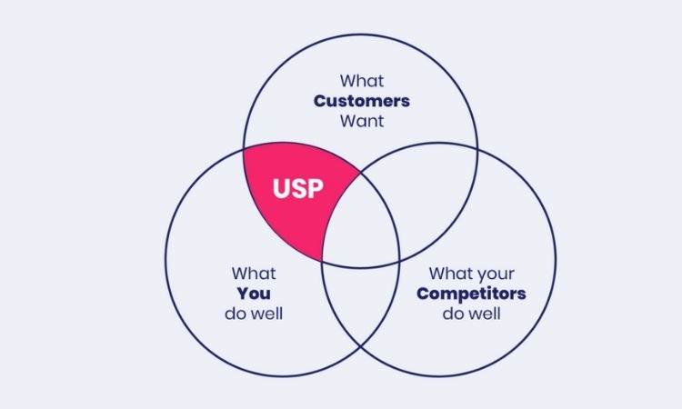
The present headline on the landing page (“making business personal”) is more of a slogan than a USP. The problem is that many firms believe their slogan to be an integral part of their company identity, especially if they have been in business for a long time. It can be emotionally draining to be pushed to the sidelines.
Get it out of your system. This is a professional situation. Take McDonald’s, for example, whose tagline “I’m lovin’ it” is possibly the most famous in the world. What is the current headline on their landing page? “The menu you know and love, plus a whole lot more.” This is a unique selling proposition. It’s a one-of-a-kind selling pitch that combines what customers already know and enjoy with fresh and intriguing options.
5. Landing page content & Ad copy
Copy is still important in today’s video and image-centric environment. In fact, A/B testing is one of the most crucial aspects of your landing page. Your text clarifies your product, provides information about your business, and encourages users to explore your website more.
First, do an A/B test on the headline. It should be very interesting and tailored to your intended audience. Replace a dull verb with a more interesting one to spice things up a little.
Then proceed to the bottom of the page. Experiment with terms and phrases that aren’t often used in your field. Many customer concerns can be addressed by compelling copy.
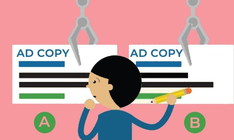
Your product description must sing if you’re utilizing your landing page A/B tests to sell a product. Begin by creating a description for the control or initial version, then make minor changes for the variant. For example, instead of a paragraph of text, consider using snappy bullet points.
Experiment with distinctive words and phrases, just like you would with the rest of the content on the page. Identify the problem that your product solves or the objective that it enables others to achieve. Focus on this to make your product descriptions more appealing to visitors.
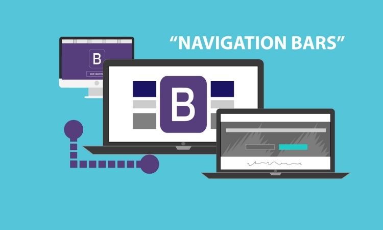
6. Navigation bars
Avoiding navigation bars on your landing pages is a recommended best practice. Although they are beneficial to use on your website, they tend to distract and lead users away from the desired action on landing pages. Despite this, navigation bars are still present on 84 percent of landing pages.
When it relates to landing pages, the simpler the better. It is simpler to convert visitors into customers if you make it easy for them to focus on their core goal.
If there’s one thing you should take away from all of these landing page A/B tests experiments, it’s that you never know what will happen. Just because those findings came out of the split-tests mentioned above doesn’t indicate your company will be successful in the same way. The more tests you conduct, the more understanding you’ll have of how your target audience interacts with the various aspects on your landing page. When it comes to A/B testing, your company should never have a set goal in mind. Your landing page can constantly be improved, which is why it’s up to your company to test it over and over again.
7. Customer testimonials & Trust symbols

The use of trust symbols or customer testimonials boosts landing page conversions almost universally. Essentially, you’re telling your landing page visitor that you’re trustworthy; that you’re not out to defraud them of their hard-earned money; and that others have put their trust in you previously and come out on top.
Visitors to your landing page A/B tests not only like seeing that you have customers, but they also trust them more than they trust you. Utilize direct quotes from the most well-known companies with which you’ve collaborated (as their business profile will increase yours).
III. Conclusion
You now understand the significance and advantages of landing page A/B tests, as well as how to do it efficiently. Use the advice and these Top landing page A/B tests to enhance your landing pages and generate more leads and sales.
Read more:
- How To Get More Reviews On Shopify Stores To Boost Sales In 2022
- Identify 5+ Best Email Automation Triggers in 2022
- Top Social Media Content Proven to Leverage Ecommerce Business 2022
- Top Clever Tactics to Do Etsy Market Research For Your Products 2022
- Ultimate Guides and Tips To Sell Etsy Digital Downloads 2022